Showing posts with label Columbia. Show all posts

Saturday, July 5, 2014

Columbia LP Covers, 1957-62

This is part 3 of a series devoted to branding changes at Columbia Records in the first fifteen years or so after their successful launch of the long-playing record in 1948.  See also part 1 and part 2.

At the end of Part 2 I showed that the cover branding arrived at by Columbia, around the spring of 1957, looked like this:


This very attractive branding was usually placed at the top right corner of the album cover. By the time stereophonic LPs were introduced by Columbia in September 1958, the arrangement had been modified slightly, with the "LP" component moved up and to the right of the Eye:


...a modification which enabled the trademarks to be displayed flush with the "stereo" indicator at the top of the cover:


(For monaural releases with a stereo counterpart, the trademarks were displayed at the bottom of the cover.)

This basic setup remained unchanged until about the summer of 1960, at which point, the trademarks lost their top-of-the-cover status on stereo issues, and they were reduced markedly in size:


The next major change to the trademarks occurred in the summer of 1961 - the "Lp" portion, presumably by then considered redundant, was dropped, and the Eye transformed into its final form with three concentric rings:


This branding lasted only a few months. By the end of 1961, new albums were featuring this greatly simplified configuration in the upper left part of the cover:


This basic design remained in use, with minor changes in typography and placement, through the late 1970s on Masterworks releases (the entire classical division of Columbia was rebranded "CBS Masterworks" around 1980), and continues in use to this day for Sony's Columbia popular releases. (Incidentally, ML 5746, a recital of French piano music by André Previn, was one of the last releases to be issued with the old "6-eyes" label - in the summer of 1962.)

So why did Columbia, having found a seemingly satisfactory formula for displaying its trademarks on album covers from 1957-60, feel the need for another change? A possible answer is hinted at in an article in the August 29, 1960, issue of Billboard Magazine headlined "Columbia, Philips in New Long-Term Pact Talks." It seems that Columbia had become dissatisfied with having Philips issue its product in Europe, and wanted its own label presence there, as RCA and Capitol already had. Since the Columbia name could not be used there, as EMI owned it, the proposed new label was to be known as "CBS Records." (Philips, for its part, did not relish the idea of giving up popular American product on its label, which is why Philips purchased Mercury Records in 1962.) My guess is that Columbia wanted to update its Eye trademark to fit a new international image. Certainly by the time CBS Records was launched in Europe in 1962, the Eye logo had assumed its new look and was being used to identify the new label.


Sunday, June 15, 2014

Columbia LP Covers, 1954-57: A Study in Branding Changes

Earliest Columbia LP cover design, 1948
(image borrowed from Collecting Record Covers)
This is the second part of a series devoted to branding changes for Columbia Records in the wake of the introduction of the LP; the first part is "Birth and Evolution of a Trademark" about the introduction of the "walking eye" in 1954.

From the earliest days of the long-playing record as introduced by Columbia in 1948, three elements were present on all cover designs of the new records: the brand name "Columbia" (with "Masterworks" added for classical releases), the company's Magic Notes logo (introduced in 1908, and modified with the addition of a CBS microphone in 1939), and the new "Lp"-in-a-circle logo to identify the new records.  The placement of these elements may have varied from year to year but the presence of them was constant over the next six years.  Here is a cross-section of a typical example from 1954, with the Notes appearing to the left of the catalog number:


But by then, the Eye had been introduced in Columbia's advertising; in fact, it appears at the bottom of the back cover of this album:


By the beginning of 1955, the Notes have disappeared from the cover, as on this cross-section of an LP reviewed in the Feb. 5, 1955, issue of Billboard:


Beginning with issues reviewed in the March 12, 1955, issue of Billboard, a curious symbol appears underneath the "Lp" logo, resembling nothing so much as a tape reel:


This seems to be designed to assure the buyer that this is a "high fidelity" recording, a catchphrase that was all the rage in the 1950s.  Columbia must have decided that this assurance could be granted much less wordily by the summer of 1955, for by then the tape reel and its associated verbiage had been deleted, and the "Lp" logo reconfigured like this (snipped from the upper right corner of ML 5035):


(Incidentally, this branding coincides with the introduction of the "6-eyes" label. I've seen copies of issues having "tape reel" covers with the old Magic Notes blue labels, but I've never seen the above branding with old labels, at least on American pressings.  Canadian pressings are another story.)

This simple, elegant branding lasted for almost a year.  With the releases of May, 1956, or thereabouts, the Eye finally appears on Columbia front covers, albeit in this curious configuration with the "Lp" logo forming its "pupil" and used in tandem with a similar eye-like device advertising "360 Sound" (a phrase first used in 1952 in connection with Columbia's phonograph line):


By the fall of 1956, the "360 Sound" part of this logo had morphed into this circles-within-squares arrangement:


...which is a bit confusing to behold, but at least has the virtue of contrast with the Eye portion of the logo.

The third version of this vertical logo, which first appeared around the beginning of 1957, is the simplest, for it dispenses with the "360 Sound" component and restores the "Lp" to its rightful place as a separate entity (I've included the fine-print portion underneath because it shows that the Eye has finally reached the status of Marcas Reg., i. e., a registered trademark):


This didn't last long either.  By the spring of 1957, the information contained in this last vertical version - the label name, the Eye, the "Lp" and Guaranteed High Fidelity - had been reworked into this easier-to-manage, (mostly) horizontal arrangement:


This was the definitive version, and would remain in place for the next four to five years, with minor variations.

Monday, May 26, 2014

Birth and Evolution of a Trademark

The discussions that took place in the comments section of this post spurred me to do a little thinking about and research into this famous Columbia trademark, the so-called "walking eye."

When I was a kid of four or five, I was always a bit spooked out by the logo, at least in its redesigned form as shown above, which was new at the time.  Those concentric circles, drawn more thickly on the sides than on the top and bottom, and surrounding that staring pupil, seemed so sinister to me!  I realized, even then, that it was a variant of the symbols lining the edges of the "6-eyes" label, several hand-me-down specimens of which I possessed:


...but those symbols looked so much "friendlier" to me, and the variant seemed like a corruption.

So where did that symbol come from?  Well, according to Gary Marmorstein's readable but inaccuracy-laden history of Columbia, "The Label" (Thunder's Mouth Press, 2007), it was the brainchild of Neil Fujita, who was brought in as Columbia's art director in 1954.  "Early in his tenure there," writes Marmorstein, "Fujita took a good long look at [CBS art director] Bill Golden's CBS Eye and reworked it so that it looked like a cartoon version of a decibel, a bug regurgitated in hi-fi.  With two legs added, it also looked like a TV antenna turned upside down; the lines that stood out showed a C and an R, mashed together, that stood for Columbia Records."

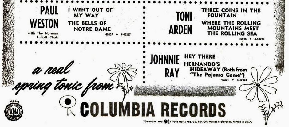
Sounds plausible enough, but lately I've been digging around in old Billboard magazines online, scouring Columbia ads from the middle 1950s, and the first appearance I can find of the "eye" logo is this one, where it forms the "O" in "COLUMBIA" (February 13, 1954):


(In case you're wondering, the snappy new musical in question is "Red Garters," the soundtrack of which was on CL 6282.) Yes, the C and the R do stand out (they're even inked more darkly in "COLUMBIA" and "Rosemary" so that you don't miss the point), but what also stands out is that without the "legs" the new logo looks like a record, not like an eye at all! So I'm a little suspicious of Marmorstein's (or Fujita's) story; the only part of it that really seems accurate is the "CR" origin of the logo.  Besides, the dates don't add up.  If Fujita came to Columbia in 1954, and this ad appeared in February, it seems highly unlikely the logo originated with him, whatever hand he may have had in developing it later.

It seems more likely that it was a happy accident, one that the folks at Columbia seized on eagerly.  By this time, the trusty old notes-and-microphone logo


may have seemed like a relic, one associated with a 78-rpm past rather than an LP future.  (After all, the "Magic Notes" in the left circle had been around since 1908!)   By the end of 1953 Columbia's Billboard ads were no longer showing the Notes prominently, instead relegating them to the fine print, as if setting the stage for something new to take their place.  (The picture above is from the Oct. 3, 1953, issue of Billboard, and represents the last occurrence I can find of so large a display of the Notes.)

The next time we encounter the Eye in Billboard advertising is in April 1954, when an ad appears encouraging dealers to obtain the 1954 catalog of 45-rpm Extended Play records, a small picture of which appeared in the ad.  I managed to find an Ebay listing for the catalog with a nice picture (but alas, not in time to actually buy it!), since the picture in the Billboard ad doesn't do it justice:


The "CR" origins of the new logo stand out really nicely here.  Appropriately, the Eye is combined here with the logo Columbia was using for EPs:


By May 22, the Eye is being displayed at the bottom of Billboard ads, and without the division down the middle that characterized its first appearances:


Meanwhile, on the back covers of Columbia's LP albums, we begin to find the following gracing the bottom (image taken from ML 4853, a Gold & Fizdale two-piano recital probably released in April 1954):


Finally, the Eye's first appearance on an actual record label:  In October, 1954, Columbia announced a new series in a Billboard ad, the "Hall of Fame" series, dedicated to reissues of pop material on 45s and 78s.  The 78 labels looked like this (image borrowed from "Note the Notes," Mike Sherman and Kurt Nauck's book about Columbia's 78 labels):


Notice that by now, Columbia has declared the Eye to be a trademark.  Notice, also, the subordinate position of the Notes.  They would be dropped altogether from the next label design, namely the "6-eyes" label pictured at the beginning of this article, developed for LPs and introduced in the summer of 1955, though they would continue appear on pop 78s until the end of their run in 1958, and on 45s until about the same time.

Part 2 of this series can be found here, with a survey of album cover branding from 1954-57.